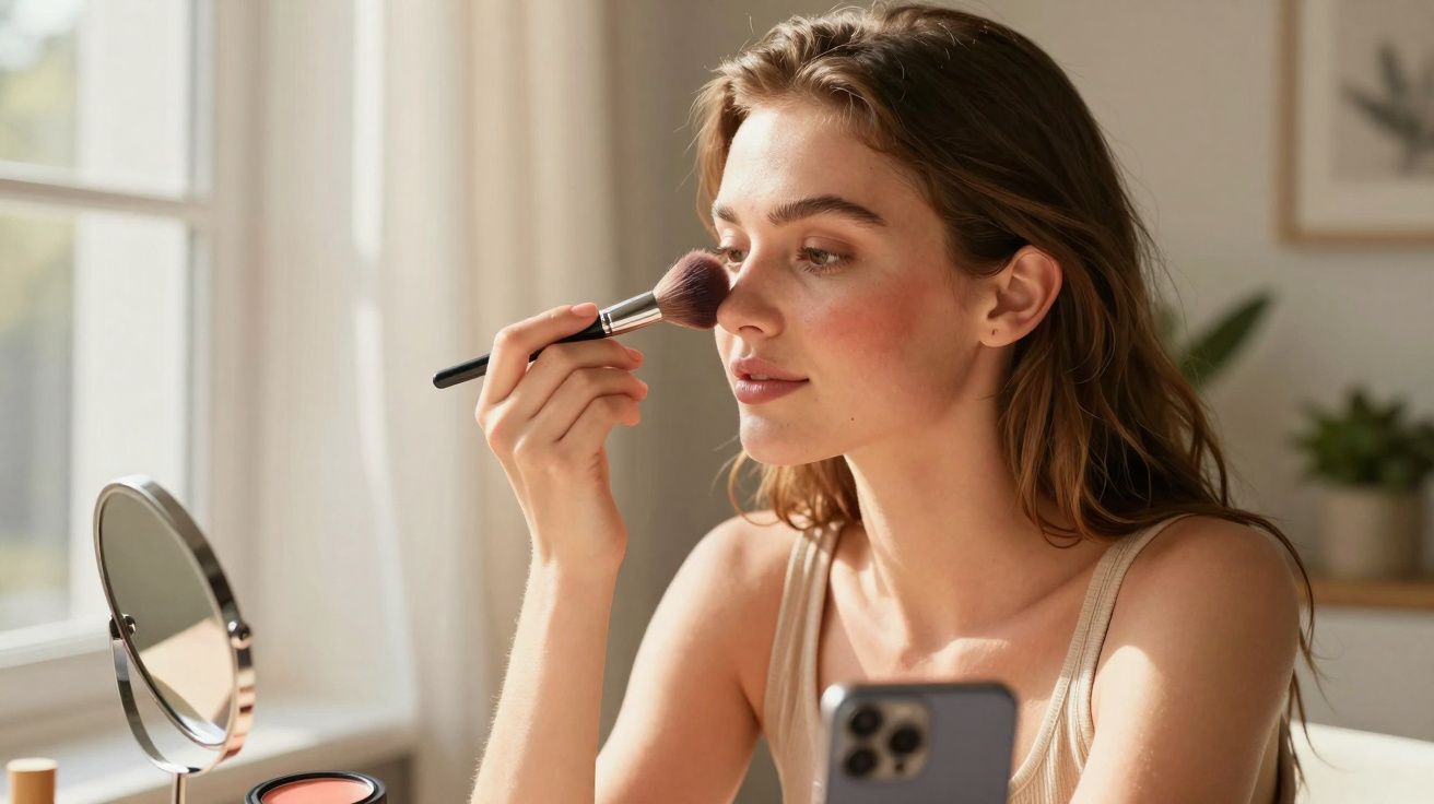
The woman in the café looked immaculate from across the room.
Her brows were crisp, the eyeliner was clean, and her lips had that glassy shine. But when she leaned towards the window, the illusion cracked. A dense sweep of blush sat right beside her nose, as if she’d just raced up three flights of stairs. The formula wasn’t the issue. The positioning was.
You’ve almost certainly noticed this too-either while scrolling TikTok or simply walking down the street: blush that drifts too far towards the centre, making the face feel tighter and the features look smaller. It often appears fine in a bathroom mirror. In daylight or on camera, though, it can throw off the entire balance.
That tiny shift of about 2 centimetres between “healthy flush” and “why does my face look crowded?” isn’t just taste. It’s geometry.
Blush placement near the nose: why it changes the whole face
When blush sits too close to the nose, the face can suddenly read as narrower and more strained. The middle becomes the focal point, while everything you usually want to emphasise-eyes, cheekbones, jawline-quietens down.
Rather than lifting, the colour pulls inward. The outer cheeks can look oddly blank, as though they’ve been wiped clean. And if you naturally have redness around the nostrils, blush placed there can amplify it, making skin look more fatigued than radiant.
From a distance, the overall impression can shift from soft and romantic to “puffy” or “busy”. Something intended to sculpt can, by mistake, compress.
Look at selfies taken under harsh office lighting and it jumps out quickly: the person still looks like themselves, but the proportions feel slightly off. The nose looks more prominent. The centre of the face feels visually noisy. The perimeter looks pale in comparison.
Why cameras and daylight punish central blush
On camera, blush that’s too near the nose tends to merge visually with any natural redness around the nostrils. Your front-facing camera software is ruthless: it heightens contrast and deepens shadows, so what should look like a diffused haze can become a solid block of colour.
Some television makeup artists even refer to a “danger zone” around the nose: too much pigment there and the face can look smaller, heavier, and more tired-especially under artificial lighting. It’s one reason red-carpet blush usually sits slightly higher and further out.
The geometry behind it: lines and visual weight
Your face isn’t a flat canvas; it’s a set of vertical and horizontal lines. Blush changes how those lines are perceived.
When colour sits close to the nose, the central vertical line (forehead to chin) can look shorter and more compact. Move that same shade outward and slightly upward and the cheekbone line reads wider, which makes the face appear more open, lifted, and relaxed. Your features haven’t changed-only where the viewer’s eye lands first.
Makeup artists often talk about “visual weight”. Blush carries a lot of attention. Place that weight in the centre and the face can look narrower. Place it more towards the sides and the face gains space, shape, and structure. It’s a small adjustment with an outsized effect.
How to place blush so it flatters, not crowds, your features
Start with a simple boundary: imagine a straight vertical line dropping down from the centre of your pupil. That’s your inner limit. Ideally, your blush shouldn’t cross that invisible border towards the nose.
Next, find your starting point. Do a small half-smile-no big grin-just enough to lift the cheek. Put the first touch of colour where the cheek naturally rounds. Then blend outward towards the top of the ear in a soft, comma-like sweep.
Build in thin layers. It’s far easier to add a believable flush than to undo a patch that has wandered into the nose area. If you’re unsure, keep a narrow strip of “clean” skin between the side of the nose and where your blush begins.
Many people pull blush inward because they’ve heard “apply to the apples of the cheeks”, then commit too literally. On a rushed morning, the brush drops too close to the nostril-and the placement becomes habit.
That habit can have different effects depending on your features: - On rounder or softer faces, central placement can make cheeks appear fuller rather than lifted. - On more angular faces, it can make the centre look harsher and distract from naturally strong cheekbones. - On textured skin, pigment close to the nose can settle into pores and fine lines, making the area look uneven.
We’ve all had that 3 p.m. reflection where you think, why do I look out of breath? Often it’s not the amount of blush-it’s where it ended up. Shifting the colour slightly outward can transform how your face reads in photos for the rest of the day.
“Blush should frame your features, not compete with them,” says a London-based makeup artist who often repositions blush for clients confused about why they “look tired” despite a full-glam face.
A quick checklist to keep blush away from the nose
- Leave at least a finger-width of bare skin between the side of your nose and your blush.
- Tilt your brush slightly upwards rather than sweeping straight across.
- Tap excess product off the brush before it touches your face.
- Blend more on the outer edge than on the inner edge.
- Step back from the mirror and check from about an arm’s length away.
Be honest: hardly anyone spends ten minutes blending blush every single day. That’s why simple visual rules-like the pupil line and the one-finger gap-are more reliable than complicated face charts. They work whether you’re using a £6 cream stick or an expensive compact while half-asleep before work.
Two extras that make placement look better (and more natural)
Tool choice matters more than people think. A smaller, fluffier brush gives you control and makes it easier to keep colour off the nose area; big, dense brushes can accidentally stamp pigment too far in. If you use a cream or liquid blush, try placing it with your fingers or a small stippling brush first, then softening the edges with a clean brush.
Skin preparation helps, too. Around the nose, texture and dryness are common, which can make blush catch and look stripy. A light moisturiser (and, if needed, a tiny amount of smoothing primer) can reduce patchiness-especially if you’re wearing blush over minimal base makeup.
Finding your own balance (not Instagram’s)
There isn’t one “correct” blush placement-only different effects you can choose deliberately. Bringing blush slightly closer to the nose can look sweet and youthful on some faces, giving a cold-girl flush. Push it too far and it can shift from editorial to uneven.
Everyone’s face is different, and so is your comfort level with visible colour. Some people love a bold, central blush that feels playful and K-beauty inspired. Others prefer a barely-there wash high on the cheekbone, like a soft-focus filter. The key is understanding what each placement does to your proportions, then choosing on purpose rather than by habit.
Next time you apply blush, run a quick experiment: do one cheek the way you usually do it (even if it’s a bit close to the nose), and place the other slightly higher and further out. Step back, take a fast photo in daylight, and compare.
Which side makes your eyes look brighter? Which side lets your nose blend back into the overall structure of your face rather than taking centre stage? Which looks most like you-not like the last tutorial you watched at midnight?
Sharing a before-and-after with a friend can be surprisingly clarifying. It isn’t about judging your face. It’s about learning how colour reroutes attention. The more you play with placement, the more you realise your face isn’t a problem to fix-it’s a composition you can arrange.
Blush near the nose is just one brushstroke in that composition, but it speaks loudly. Once you understand that, you can turn its volume up or down whenever you like-not to hide anything, but to decide what people notice first.
| Key point | Detail | Why it matters |
|---|---|---|
| Distance from the nose | Leave a slim strip of bare skin between the nose and blush | Stops the centre looking “crowded” and keeps features balanced |
| Placement guide | Don’t cross the vertical line beneath the centre of the pupil | Helps blush look lifting rather than heavy or puffy |
| Direction of blending | Blend outward and slightly upward towards the ear | Opens up the face, highlights cheekbones, photographs better |
FAQ
Why does my blush make my nose look bigger?
Because the colour sits too close to the sides of the nose, it draws attention there and can make the area look wider-especially if you already have natural redness around the nostrils.Is it ever okay to put blush near the nose?
Yes. A light touch can work for a “sun-kissed” or cold-girl effect, but keep it sheer and avoid a solid stripe that blends into nostril redness.Where should I start my brush on the cheek?
Begin on the roundest part of the cheek with a small half-smile, then blend outward and slightly upward-not inward.Does cream blush behave differently from powder near the nose?
It can. Cream may melt into pores and look patchy if the skin is oily, while powder can cling to dryness. Prepare the area and use less product close to the nose either way.How can I fix blush that’s too close to my nose?
Soften the inner edge with a clean sponge or brush, then tap a little foundation or concealer over the area to recreate that narrow strip of bare skin.
Comments
No comments yet. Be the first to comment!
Leave a Comment