Colours are everywhere, from your phone screen to your bed linen. Plenty of people assume they choose shades purely because they like them. Colour psychologists argue it’s rarely that straightforward. Your favourite colour often follows a pattern - and that pattern can reveal a surprising amount about how you think, feel and come across to others.
How colours quietly mirror your personality (colour psychology)
Colour specialists such as Karen Haller and the English therapist Angela Wright have spent years exploring how different tones affect the mind. Their central premise is simple: colour isn’t just decoration - it’s emotion. Each shade can trigger a particular mental and emotional state in the brain, whether we intend it to or not.
"If you understand which colour sparks which feeling, you can make more conscious choices: what I wear, how I decorate, what feels good for me today?"
Angela Wright explains this link between colours and personality through seven core principles:
- Every shade evokes its own psychological state.
- Basic human responses to colour are, worldwide, surprisingly similar.
- Each shade fits into one of four colour families.
- Colours from the same family usually work well together.
- People can also be grouped broadly into four personality types.
- Each type tends to feel especially drawn to particular colour families.
- Whether a palette feels “right” often depends heavily on your type.
That may sound theoretical, but it has a very practical payoff: once you recognise your colour family, you can choose clothing, make-up and interiors in a way that supports your character and mood - rather than fighting against them.
Four personality types, four typical colour worlds
Many colour tests start with a quick prompt: which description do you immediately feel closest to? Behind that simple choice sit four broad personality directions - and, linked to each, a set of colours that tends to feel natural.
Type A: Big laughs, spontaneous, always in the thick of it
People in this group often come across as open, warm and easily excited. They thrive on variety, fresh stimuli and spur-of-the-moment ideas. Starting several things at once is easy for them; sticking with one task for a long stretch is more difficult. In groups they bring momentum and buzz, though others can sometimes read them as a bit scattered or superficial. Approval and opinions from other people often matter to them.
Best-fitting colour world: clean, bright, cheerful shades - for example bold yellow, orange, vivid coral and luminous blues. These are colours that catch the eye and lift the mood instantly.
Type B: Understated, dependable, more comfortable off-stage than centre stage
If you recognise yourself here, you likely seem calm, polite and unflashy. You’re more inclined to make sure others feel at ease than to draw attention to yourself. From the outside, this can sometimes be mistaken for shyness or coolness, but it’s usually rooted in sensitivity and a strong desire for harmony. Loud bustle is draining; a concert, a quiet night in, or an elegant theatre trip will often suit you better.
Best-fitting colour world: muted, gentle shades - such as cool blue, misty grey, soft pastels and deep teal. These colours communicate elegance quietly rather than shouting, “Look at me!”
Type C: Warm-hearted, curious, emotionally intense
People of this type are strongly interested in motives and what lies beneath the surface. They listen, ask questions and want to understand. They tend to enjoy real conversation in a small group more than light, surface-level chat. At the same time, there’s often a rebellious or eccentric streak. When they care about something, they can be very forthright and may even come across as dominant. Underneath, there’s powerful emotion - sometimes simmering, sometimes explosive.
Best-fitting colour world: deep, expressive shades - for instance rich green, strong red, intense purple and warm berry tones. These colours suggest depth, passion and individuality.
Type D: Strong presence, defined style, high standards
Here you meet people with impact. When they walk into a room, they’re noticed. They like glamour, crisp lines and quality materials. Decisions are usually made quickly and rationally. They work with focus, speak plainly and are happy to take an unconventional route. Some experience them as distant or tough; in reality they often live by a clear rule: half measures aren’t worth it.
Best-fitting colour world: high-contrast, polished shades - such as black-and-white pairings, cool navy, deep red and metallic tones. These colours communicate structure, strength and self-assurance.
How to identify your personal main colour
Alongside your broader colour family, one specific favourite colour can carry special weight. It can function like an emotional anchor. A small test can help you choose that colour more deliberately.
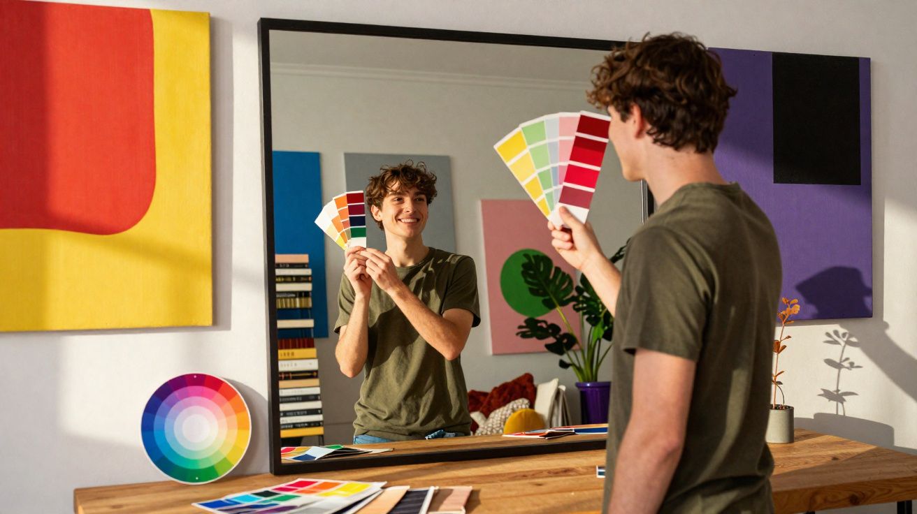
The mirror test: which shade makes your face look brighter?
A simple first step is to check your reaction in the mirror:
- Remove make-up and find the most neutral light you can - ideally daylight.
- Hold a piece of fabric or paper in one specific colour directly under your chin.
- Watch your face, your eyes and your overall appearance closely: does your skin look fresher or more tired? Do your eyes seem clearer or duller?
- Then test a clearly different colour and compare.
If your face seems to light up, your eyes look more lively and your skin appears smoother, that shade is likely a strong match for your type. If everything looks washed out, tired or patchy, it’s probably not the right one.
"If you notice, ‘With this colour I look like I’ve had three extra hours of sleep’, you’ve hit the jackpot."
Three steps to understand what your colour means emotionally
Colour psychologists suggest you shouldn’t rely on the mirror alone - memories and feelings matter too. A short writing ritual can help:
- 1. Write down your favourite colour: Which shade comes to mind immediately? If several appear, list them all and then choose the most important one.
- 2. Get specific: Don’t stop at “blue”; choose something like “sky blue”, “navy” or “turquoise blue”. The more precise you are, the more meaningful it becomes.
- 3. Collect three meanings:
- Personal memory: what experience do you associate with this colour?
- Cultural meaning: what does it represent in your environment? (e.g. mourning, celebration, calm)
- Psychological effect: how does it change your mood and your behaviour?
What individual colours can reveal about your needs
Use the overview below as a guide. It shows which emotional needs often sit behind a preference for certain tones.
| Colour | Signal to your mind |
|---|---|
| Red | A boost, drive, courage - useful when you need momentum. |
| Bright pink | Stamina, inner strength, self-confidence. |
| Soft pink | Compassion, comfort, self-care. |
| Yellow | Optimism, lightness, joy. |
| Orange | Playfulness, sociability, fun. |
| Brown | Stability, being grounded, safety. |
| Dark blue | Concentration, clarity, cool-headed thinking. |
| Turquoise | Alertness, exchange, openness. |
| Light blue | Calm, creativity, expansive thinking. |
| Dark green | Healing, inner balance, trust. |
| Light green | Renewal, freshness, new energy. |
| Purple | Introspection, searching for meaning, spiritual depth. |
| White | Order, clarity, a fresh start. |
For instance, if you suddenly reach for dark green more often during stressful periods, you may be signalling to yourself unconsciously: I need calm and inner stability. People who surround themselves with pink after a breakup are often offering themselves comfort and gentleness.
Using colour consciously in everyday life
Colour psychology stays abstract unless it shows up in real life. Even small changes can have an effect:
- Wear a top in a “courage colour” on days when you have difficult conversations.
- Choose a scarf in a calming shade for irritating commuting hours.
- Use a coloured notebook designed to prompt creativity or sharpen focus.
- Add cushions or a throw in the living room that meets your need for comfort and security.
What matters is not copying a trend colour without thinking. The key question is what that shade does to you personally. Two people can experience the very same red completely differently - for one it’s pure motivation, for another it’s simply too loud.
If you like experimenting, you can also work with combinations: yellow and light blue for lighter, more creative days. Navy with white for structured, practical phases. Soft green with pink for healing and compassion - especially at times when you want to treat yourself more kindly.
Colour psychology doesn’t replace therapy, but it can make inner themes easier to notice. When you pay honest attention, you quickly realise: a favourite colour is rarely just “nice” - it tells a story. And that story often fits your personality remarkably well.


Comments
No comments yet. Be the first to comment!
Leave a Comment