Most of us settle on a favourite shade almost by habit. Yet colour psychology suggests those preferences can point to far more than taste: emotional needs, tucked-away memories, and the way we operate in social settings.
Colour psychology: why colour keeps following your personality around
Not long ago, colour psychology was easy to dismiss as lifestyle chatter. Over recent decades, though, it has developed into a more organised discipline that draws on design practice, neuroscience and behavioural research. In the UK, two names are often credited with bringing this work into the mainstream: colour consultant Angela Wright and colour specialist Karen Haller.
Their shared position is straightforward: our responses to colour are rarely random. What looks like “a lovely blue shirt” or “an overly aggressive red logo” tends to provoke a consistent reaction, shaped by how the brain interprets light, contrast and pattern. That helps explain why one person relaxes instantly in muted tones, while another only seems fully themselves in bold, saturated colour.
Colour isn’t merely visual decoration. It works as an emotional shortcut, nudging how we think, feel and behave.
Wright’s approach goes a step further: she argues that colours follow psychological principles-and people do, too. When the two align, the result is often less internal friction and a stronger sense that your outer appearance matches your inner state.
The seven principles behind your reaction to colour
In Angela Wright’s framework, colour responses follow recognisable rules. Put simply, it rests on seven key ideas:
- Each hue tends to prompt a distinct psychological state, from alertness to calm.
- Many responses show up across cultures, hinting at shared human patterns.
- Every colour family fits into one of four main groups, each with its own overall mood.
- Colours from the same group usually feel harmonious together.
- People can also be mapped into four broad personality patterns.
- Each personality pattern typically “fits” one group of colours more naturally.
- Our emotional reaction to a palette often reflects our personality type.
This thinking now underpins consultancy work in branding, interior design and personal styling. It also leads to a more personal question: beyond fashion trends and dress codes, which colours genuinely reflect your inner landscape?
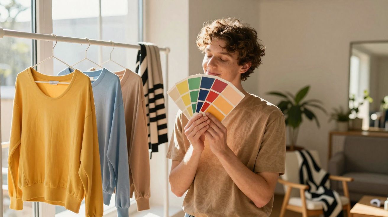
Four personality sketches and their colour instincts
Colour specialists often begin by observing behavioural tendencies, then identifying the palettes that feel most naturally supportive. The four sketches below-adapted from workshop practice-aren’t clinical labels. Think of them as “mood mirrors” that can help you notice patterns.
a. The playful extravert
You brighten a room quickly. You’re drawn to spontaneous plans, quick humour and last-minute road trips. Others often experience you as fun and easy to be around. You juggle several things at once-sometimes too many-and may find it difficult to finish one task before starting another. You care about how you come across, and you can occasionally seem a bit scattered.
This temperament often prefers bright, warm tones: energising oranges, vivid corals and lively yellows. These shades mirror a need for stimulation, variety and visible joy.
b. The quiet anchor
You don’t chase attention. You’d rather create comfort for others-supporting instead of performing. Some people misread your reserve as shyness or distance because you take time to open up. Under pressure, you tend to remain steady and measured. Your ideal evening might be a classical concert, a ballet, or a small event that feels thoughtfully curated. You value discreet elegance and tactile quality: good fabrics and well-made objects.
Soft blues, greys, gentle neutrals and cool pastels often complement this profile. They reinforce a preference for harmony, stability and understated refinement.
c. The expressive connector
You’re warm, emotionally perceptive and sincerely interested in what drives people. You enjoy conversation that goes beyond small talk. A long dinner with a few close friends suits you more than a loud crowd. You can veer towards eccentricity and, at times, a rebellious streak. When pushed too far, your assertiveness can become sharp, and others may experience you as intense or dominant.
This personality often gravitates towards deep greens, rich teals, complex purples and layered tones that feel meaningful. Those colours echo a drive for connection, depth and authenticity.
d. The striking minimalist
You have a clear sense of style and a strong eye for impact. A touch of theatre appeals to you: clean lines, bold shapes and decisive choices. You’re typically efficient, future-oriented and direct. Some people may find you distant-or even severe-especially when you move quickly from task to task. Half-measures rarely interest you.
High-contrast black and white, saturated jewel tones and sleek metallic accents often suit this temperament. They emphasise clarity, ambition and a taste for sophistication.
When your colours fit your temperament, you stop feeling “dressed up” and start feeling like a sharper version of yourself.
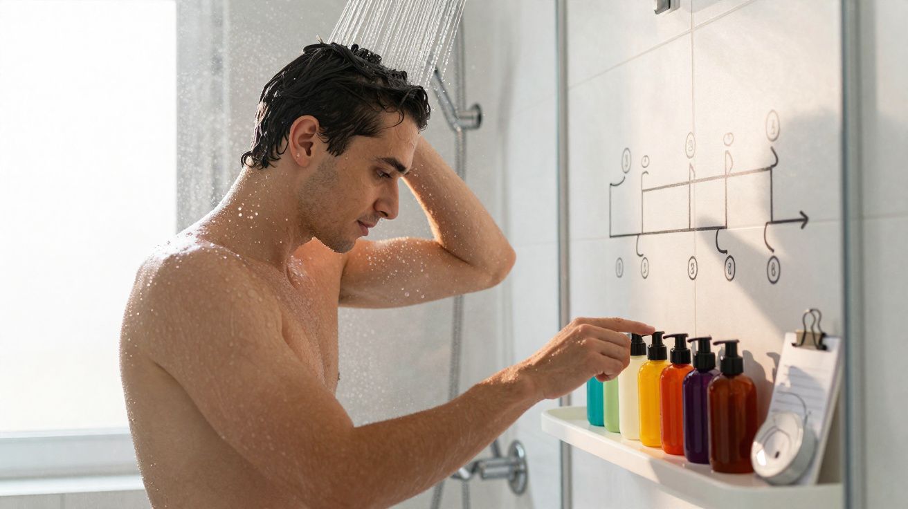
How to test which colours really work on you
Karen Haller and other consultants often recommend simple, low-tech experiments you can do at home. The aim isn’t to obey a rigid chart; it’s to observe how your face and body respond.
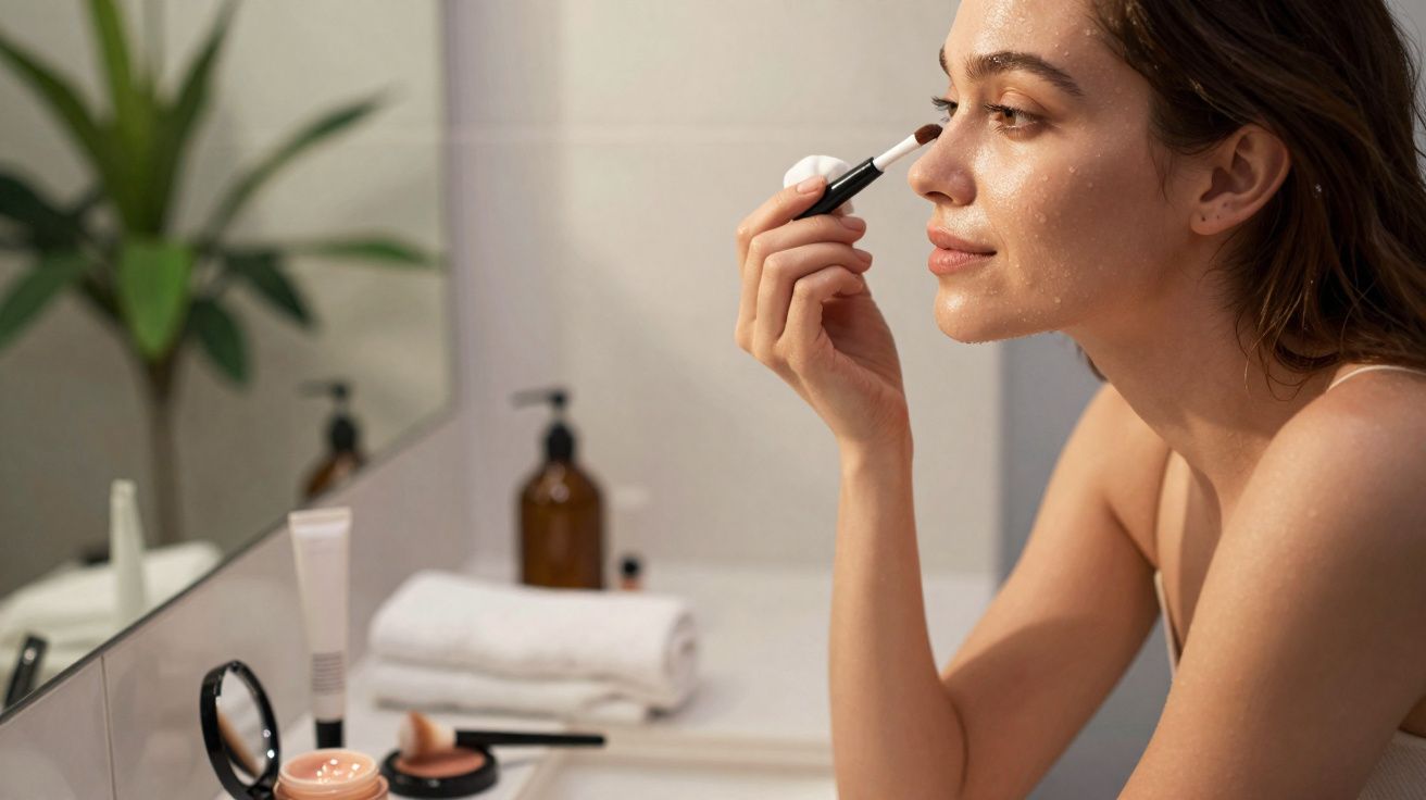
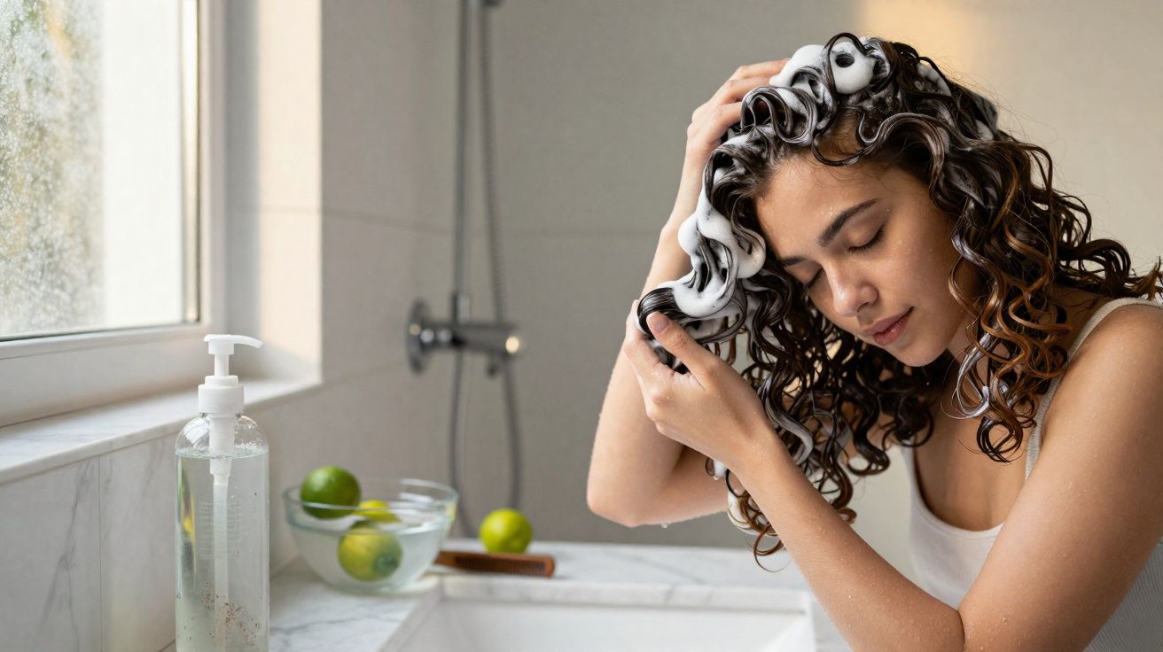
Step-by-step face test in natural light
Set aside ten quiet minutes and gather a few coloured fabrics, scarves or sheets of paper. Then work through the following:
- Remove make-up and sit with a mirror near a window or another strong source of natural daylight.
- Hold one colour beneath your chin so the tone reflects onto your neck and cheeks.
- Notice your skin: does it look clearer and fresher, or slightly dull? Do shadows look more pronounced, or softened?
- Switch to a second colour from a very different family and compare the effect.
When a colour suits you, your eyes often appear brighter, your skin looks smoother, and your overall expression seems more awake. When it clashes, under-eye shadows can look deeper, lines can appear harsher, and your face may look a little drained.
A supportive colour doesn’t compete with your features. It backs them up quietly, like flattering daylight.
Two practical notes make this test more reliable. First, light matters: morning daylight, overcast skies and warm indoor bulbs can all shift how a colour reads, so repeat the comparison on more than one day if you can. Second, screens lie-phone and laptop displays vary hugely, so fabric, paper or paint cards tend to give you a truer result than digital swatches.
From favourite colour to emotional needs
Colour choices can signal emotional priorities as much as aesthetic ones. A short writing exercise often makes that link clearer.
Three questions to decode your favourite shade
- Name the exact colour. Not just “blue”, but “sky blue”, “navy” or “glacier blue”. Specificity changes what you notice.
- Link it to a memory. What person, place or experience comes to mind with this colour?
- Note its cultural meaning. In your family stories or wider culture, what does the shade typically represent?
- Observe your reaction. When you wear it or see it often, how do you feel-calmer, braver, more open?
Writing by hand can surface details you might skim past in a quick mental check. Many people realise their “favourite” colour no longer matches their current season of life, while a different shade quietly starts dominating their wardrobe or home.
What different colours tend to signal emotionally
Psychologists are careful about fixed colour meanings because context changes everything: hospital green doesn’t feel like forest green. Even so, certain associations recur across research and design practice.
| Colour | Typical emotional signals |
|---|---|
| Red | Drive, physical energy, courage, urgency. |
| Bright pink | Tenacity, bold self-expression, unapologetic confidence. |
| Soft pink | Care, gentleness, self-compassion. |
| Yellow | Optimism, self-belief, lightness of mood. |
| Orange | Playfulness, sociability, shared joy. |
| Brown | Grounding, stability, connection to the tangible. |
| Dark blue | Focus, clarity of thought, seriousness. |
| Turquoise | Mental freshness, collaboration, openness to ideas. |
| Light blue | Calm creativity, mental space, gentle reflection. |
| Dark green | Recovery, reassurance, steady balance. |
| Light green | Renewal, refreshment, new beginnings. |
| Purple | Introspection, big-picture thinking, spiritual awareness. |
| White | Clarity, order, simplicity and reset. |
These aren’t strict rules. Someone recovering from burnout may lean into light greens and blues to cool their system down, while someone launching a risky project might keep red accents close to feel bolder.
Using colour as a daily mental health tool
Some therapists working with trauma and anxiety bring colour into sessions in small, practical ways. The intention isn’t to “heal through pigment”, but to create micro-rituals that support emotional regulation.
One method is to build a “support palette”: three or four shades that reliably make you feel safer, steadier or more energised. People then weave those colours into everyday life through a mug, notebook, scarf or phone wallpaper. Over time, the brain can begin to link those visual cues with a calmer or more focused state.
Another tactic uses colour to reinforce boundaries. For example, someone working from home might keep one colour scheme for the work zone and a completely different scheme for rest areas. Even in a small flat, that contrast can help the body recognise “on” versus “off”.
It’s also worth considering accessibility: colour-blindness and low-vision needs can alter how palettes are experienced. If you’re designing a shared space-or even choosing a household colour scheme-contrast, texture and lighting become as important as hue so that the environment feels supportive for everyone, not just visually pleasing.
Where personality meets design, and where it clashes
We rarely choose colour in a vacuum. Couples disagree over paint charts, office teams complain about “aggressive branding”, and teenagers repaint bedrooms in shades their parents can’t stand. This is often where the personality–colour relationship becomes most obvious.
A highly sensitive person may feel depleted in an open-plan office saturated with reds under bright LED lighting. A risk-taking entrepreneur may feel strangely flat in a beige, low-contrast environment. Neither response is irrational; each reflects a different nervous system and a different emotional baseline.
Designers increasingly talk about colour zoning in shared spaces-creating pockets for different needs. A breakout area might lean into energising oranges and yellows, while a quiet corner relies on deep greens and soft blues. At home, the same approach can ease friction: one room carries the bold statements, while another offers visual rest.
If you’re curious about personality, colour can become a subtle diagnostic tool. Watching which shades you crave, avoid or slowly stop choosing over time can reveal shifts in energy, values and identity that formal tests sometimes miss.

Comments
No comments yet. Be the first to comment!
Leave a Comment