Behind this choice lies more than simple taste.
Colour researchers argue that our favourite colours can reveal a surprising amount about personality, mood and deeper needs. If you look a little closer, you can use colour more deliberately in a few straightforward ways – to support wellbeing, enhance your presence and bring more mental clarity.
How colours quietly influence our psychology
Colours are everywhere: in the office, in the bathroom mirror, on social media. We often register them only in passing, yet the body and brain respond to them very clearly. British expert Angela Wright describes colour as a silent code that triggers particular psychological reactions.
"Every shade affects our feelings – whether we want it to or not. If you know your palette, you can use this system to your advantage."
According to Wright, seven core principles help explain why some colours lift us up while others leave us irritated or drained:
- Every shade evokes a specific emotional state.
- Many colour effects are similar across cultures.
- Each nuance belongs to one of four colour groups.
- Colours from the same group tend to harmonise especially well.
- People can be broadly divided into four personality types.
- Each type is drawn towards a particular colour group.
- Our response to a colour palette usually aligns with our underlying type.
Colour psychologist Karen Haller has taken these ideas and refined them over years through coaching and workshops. Her premise is simple: if you understand your own “colour language”, you can make more intentional choices about what you wear and how you shape your home – and, in turn, influence your mood and the impression you make on others.
Four personality types – four colour worlds in colour psychology
A practical way in is to start with four broad personality types. They are not a laboratory-grade personality assessment, but they can offer useful clues when you’re exploring your personal colour palette.
Type A: The spontaneous doer
People in this group are typically open, lively and drawn to action.
- extroverted, friendly, often highly sociable
- enjoys variety, new plans and spontaneous ideas
- can come across as funny, playful and sometimes a little chaotic
- tends to begin lots of things at once
- pays close attention to other people’s opinions
This type often suits bright, high-energy colours such as strong red, orange or intense yellow – shades that communicate outwardly: something is happening here.
Type B: The calm observer
This type tends to avoid the spotlight and is highly attentive to other people’s comfort.
- reserved, polite, a quieter presence
- may seem shy or distant to strangers
- stays remarkably composed even under pressure
- likes understated elegance, clean lines and high-quality details
- has a refined sensitivity to materials and touch
Rather than bold statement colours, these individuals often opt for muted blues or greys, soft rose, taupe or toned-down greens. The palette mirrors their quiet, orderly nature.
Type C: The warm-hearted bundle of energy
Here you’ll find people who are warm, emotional and deeply interested in others.
- open, curious, asks lots of questions
- loves intense conversations in small groups
- can be creative, unconventional, even a touch eccentric
- may occasionally come across as domineering
- strong feelings simmer beneath the surface
Type C is frequently drawn to rich, expressive shades: deep berry tones, vivid turquoise, warm red and intense purple. Colours that show emotion rather than conceal it.
Type D: The stage is yours
People of this type stand out – often without trying to.
- appears confident and self-assured
- enjoys polished appearances and clear statements
- works with focus, precision and clear goals
- has a strong sense of style
- can seem cool or hard to approach
Bold contrast tends to work well here: deep black, clean white, elegant navy, saturated emerald green and metallic accents. Nothing half-hearted – more glamorous and sharp-edged.
How to find your personal colour palette
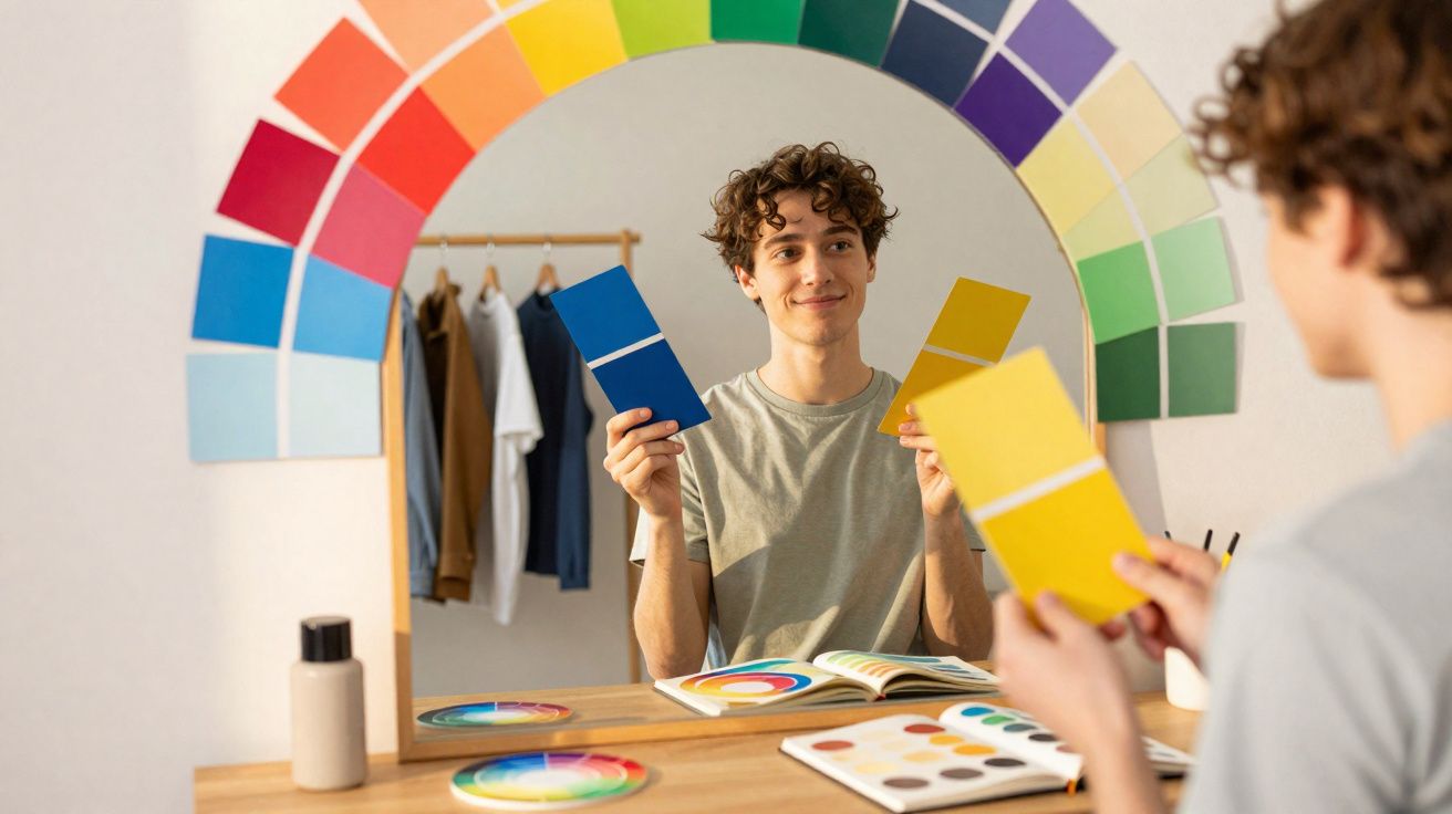
Theory is one thing; it becomes far more interesting when you test colour against your own face. Haller recommends a simple mirror test that works best in natural daylight.
The mirror test in three steps
- Remove make-up, sweep hair away from your face, and sit in front of a mirror in daylight.
- Hold a piece of fabric or paper in one colour under your chin.
- Watch your expression, eyes and skin: do they brighten, or do they look tired?
Switch between colours you like and colours you instinctively dislike. The contrast often appears within seconds:
- good colour: eyes look clearer, skin looks fresher, the face seems more awake overall
- unhelpful colour: eyes appear to drop visually, shadows under the eyes look stronger, skin seems dull
"If your face practically lights up, the colour suits you – and belongs in your wardrobe."
If none of your first picks work, it can help to try neighbouring shades: instead of a loud yellow, perhaps a muted mustard; instead of stark white, a softer cream.
Your favourite colour as an emotional compass
Beyond how a shade looks on the outside, your inner response matters just as much. A short writing ritual can help you sort out what your favourite colour is really signalling.
Three questions to ask your favourite colour
- Which colour do you like most, instinctively? If you love several, write them all down and then cross them out until only one remains.
- What is its exact name? Not simply “blue”, but “sky blue”, “petrol”, “midnight blue”. The more precise, the better.
- What does it trigger in you?
- personal memory: what experience do you associate with it?
- cultural meaning: what does this colour represent in your environment?
- psychological effect: how does it change your mood or behaviour?
Even thinking it through can put a lot in order: why do you avoid certain shades? Why do you feel “dressed up” in some colours, yet instantly authentic in others?
What specific colours can reveal about your current needs
It gets especially interesting when you notice that, in certain phases, you keep reaching for the same tones. That pattern can hint at what you’re looking for internally. Here is a compact overview:
| Colour | Possible message |
|---|---|
| Red | A desire for energy, motivation and the courage to make decisions |
| Bright pink | A need for perseverance and a boost of self-confidence |
| Soft pink | A longing for affection, self-care and gentleness |
| Yellow | Seeking lightness, optimism and inner sunshine |
| Orange | Craving joie de vivre, sociability and fun |
| Brown | A need for stability, grounding, “feet on the ground” |
| Dark blue | Focus on concentration, clarity and structure |
| Turquoise | A wish for mental wakefulness, exchange and team spirit |
| Light blue | Seeking calm, creativity and inner spaciousness |
| Dark green | A need for recovery, inner balance and security |
| Light green | A desire for freshness, a new start and rest |
| Purple | Interest in reflection, searching for meaning and spirituality |
| White | A longing for clarity, order and a “fresh start” |
You don’t have to commit to a single colour. Often, a kind of “emotional wardrobe” emerges: red for important presentations, blue for office days, light green for the weekend and recovery.
Using colours consciously in everyday life
Once you understand how your palette affects you, you can use it to steady yourself – particularly on stressful days. A few simple examples:
- Before exams or important meetings, many people reach for dark blue or dark green to support concentration and stability.
- After a demanding week, gentle light green or soft pink can feel soothing, whether as a hoodie, scarf or bedding.
- When motivation dips, small red or orange accents can help: lipstick, a phone case, a notebook.
- When everything feels chaotic, areas of white or cream at home can create calm – for example a light desk or neutral curtains.
Visibility matters: the colour needs to show up in your real routine, not only as a theoretical idea. A T-shirt, a mug or a poster by your workspace is often enough to set a subtle mood cue.
What colour psychology is based on – and where its limits lie
Colour psychology is not a “magic trick”; it rests on recurring patterns in perception and culture. Red affects the circulatory system differently from blue, and brightness differs from darkness in how it’s experienced. Even so, it remains deeply personal: someone with a traumatic memory linked to a particular colour will react differently to it than most people.
That is exactly why personal reflection is worthwhile: what does your own way of seeing colour say about you, your story and what you need right now? If you engage with it, you may not only end up with a more considered wardrobe – you may also understand more clearly why some colours make you feel immediately “like yourself”, and why others simply don’t.


Comments
No comments yet. Be the first to comment!
Leave a Comment