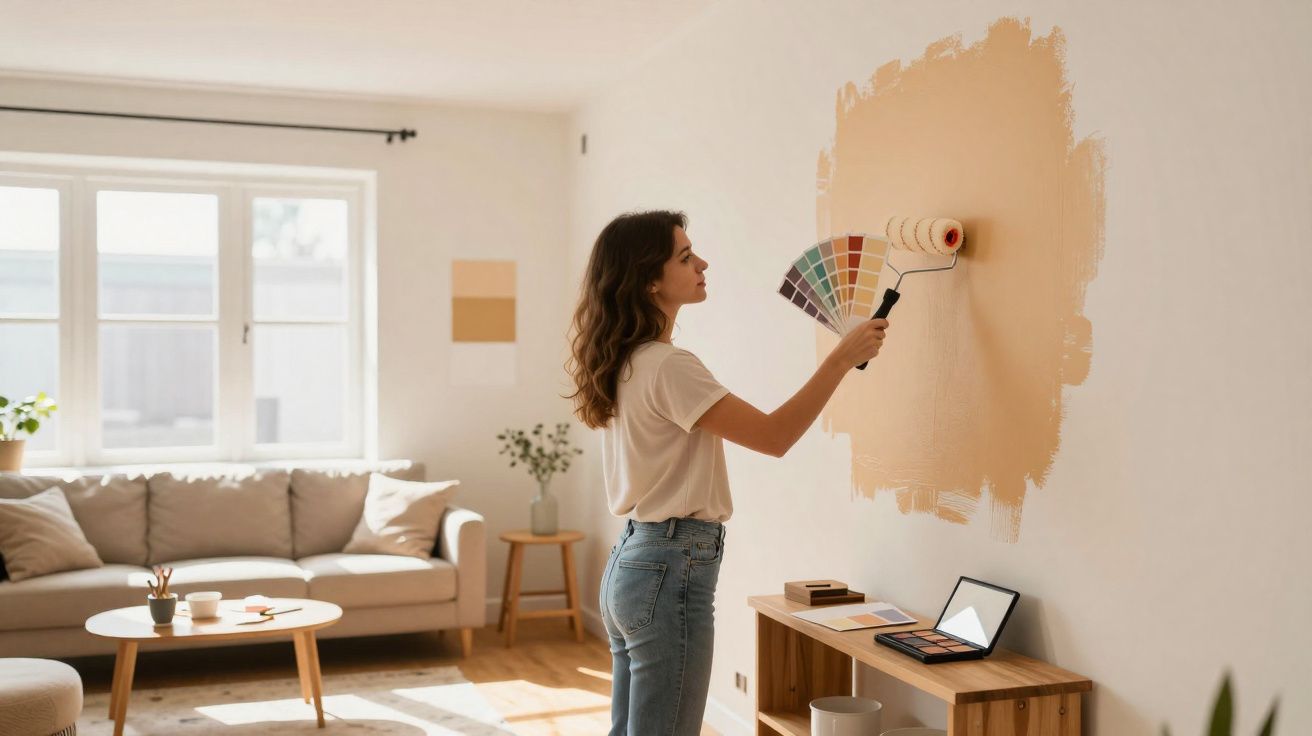
Many flats look flawless in photos yet feel oddly “off” in real life: too long, too tall, too narrow, too cool. Before you start sketching stud walls or spending a fortune on furniture, there’s a surprisingly straightforward option: a paint technique borrowed from make-up that relies on light, shade and contrast.
What’s behind room contouring
In make-up, contouring reshapes the face using nothing but lighter and darker tones. The same principle can be applied to interiors. By giving walls, ceilings and architectural features deliberately different strengths of colour, you change how the eye “reads” the proportions of a room.
"The basic idea: dark colours make surfaces recede, while light ones bring them visually forward - and that can have a surprisingly strong effect on proportions."
Colour specialists such as Helen Shaw from Benjamin Moore explain that the aim isn’t simply to paint something “nicely”, but to paint strategically:
- position light and dark areas with intention
- treat ceilings, walls and alcoves differently
- highlight dominant structural elements or soften them visually
- create a sense of depth rather than relying on actual floor area
On paper, you don’t gain a single square metre. Psychologically, though, the impact is significant: a tall room feels more snug, a long narrow space feels less claustrophobic, and a vast sitting room stops reading like a hall.
Using colour to cheat proportions: common awkward rooms
Long, narrow rooms: push the sides back and pull the end walls forward
An over-long lounge or hallway can feel like a tunnel. A simple colour rule helps:
- paint the long side walls slightly darker so they appear to fall away
- keep the end walls lighter so they seem closer
- leave the ceiling neutral or a touch lighter, so it doesn’t feel oppressive
The result is a room that looks shorter and more balanced. If you’re confident, you can also give one end wall an extra warm or stronger shade - for instance, a softened red or a warm petrol tone - to create a clear visual “stop”.
Oversized, cool living spaces: darker shades add structure
A very large living area with white walls can quickly feel chilly and echoey. Interior designers often respond by choosing deeper colours for the main walls. Designer Melissa Oholendt used rich, dark wall colours in a particularly large room. The effect: the space feels less sprawling and the mood noticeably warmer.
The ceiling treatment matters too. Instead of standard white, she chose a taupe-grey finish, which smooths the transition into neighbouring areas such as the hallway and dining space. The plan still feels open, but each zone gains its own atmosphere.
Sloping ceilings and low overheads: colour as an “optical lift”
In attic rooms or period properties with very low ceilings, it’s easy to feel boxed in. Here, the ceiling does the heavy lifting. If you keep it clearly lighter than the walls, it immediately feels less weighty. The illusion becomes stronger if you “pull” the wall colour upwards slightly - leaving a band of wall colour about 5–10 cm below the ceiling line. That nudges the eye into placing the ceiling higher than it really is.
Conversely, a very high ceiling can feel more intimate when it’s painted a little darker than the walls. Suddenly the room reads less like a cathedral and more like somewhere to relax.
Window walls and bay windows: weak point or centre stage
Large windows or bay areas often steal all the attention. You can try to hide them - or deliberately turn them into a feature. Designer Jennifer Hunter chose the second option in a bedroom by giving the bay area a warm yellow. The results:
- your gaze naturally moves towards the window zone
- the light yellow intensifies the impression of sunlight
- the bay’s depth becomes more pronounced, making the room feel longer
Combined with a floral wallpaper pattern, it can feel as if a summer meadow begins right outside. The same kind of accent works in less romantic schemes too - for example, a gentle sand tone in a home-office bay, or a slightly muted mint around a kitchen window.
Matte, satin and gloss: why finish matters
With room contouring, the shade isn’t the only variable - the finish is just as important. Different sheen levels bounce light in very different ways, which can dramatically change the perceived depth.
| Finish | Light effect | Best used for |
|---|---|---|
| Matte | reflects very little, absorbs light, boosts depth | large wall areas, corners, back walls, cosy alcoves |
| Silk / Satin | subtle sheen, moderate reflection, picks out detail | doors, trim, built-ins, shelving, window reveals |
| Gloss | strong reflection, highlights every imperfection | sparing accents, e.g. a single moulding or a piece of furniture |
Paint professionals often recommend matte (or at most a velvety finish) on surfaces that should recede or create depth. Glossier paints are better reserved for targeted highlights - a door in a lightly glossy enamel, a bookcase in satin, or a deliberately emphasised window reveal.
"Matte for volume, satin for details, gloss only as the finishing touch - that way the room won’t feel visually restless."
Practical colour strategies for everyday spaces (room contouring)
Narrow hallways in older homes
Long corridors can easily feel like you’re walking through a shaft. One effective move is to paint the end wall in a saturated, warm shade - terracotta or a deep blue-green, for instance. Keep the long walls lighter and more neutral. If you make the ceiling fractionally darker than the walls, you also reduce the sense of height and make the passage feel cosier.
Open-plan kitchen–dining–living rooms with no clear zones
Many new-build flats combine cooking, eating and living in one large room. Room contouring can define areas without adding furniture walls:
- give the dining area a coloured wall or niche as a visual “backboard”
- frame the living area with a slightly darker surround, for example around the sofa zone
- keep the kitchen lighter so it doesn’t feel heavy
If you also vary ceiling colours by zone - slightly darker above the dining table, neutral above the sofa, for instance - the boundaries become clearer without losing a single centimetre of floor space.
Children’s bedrooms and home offices: use colour psychology
Contouring isn’t only about surfaces; it’s also about mood. A home office benefits from calm, cooler tones on the wall behind the desk, while the area behind the camera (for video calls) can handle a warmer, more welcoming shade. In a child’s bedroom, a darker matte colour behind the bed can feel like a protective cocoon, while the remaining walls stay bright and friendly.
Mistakes that can ruin the illusion
For the effect to work, it pays to plan briefly before the first brushstroke. Common pitfalls include:
- too many colours: three main tones per room is usually plenty
- emphasising the wrong surfaces: darkening an already dominant wall can increase imbalance
- messy edges: crisp lines matter, otherwise the room can look blotchy
- too much shine: glossy areas reveal every uneven patch and often destroy the depth you’re trying to create
Small tester swatches in several spots around the room help you judge the lighting properly. Daylight, artificial light and shadow all shift how colour is perceived.
Why this make-up-inspired trick works so well
Our brains rely on shortcuts: light surfaces read as closer, dark ones as further away, and contrast pulls attention almost automatically. This painting method taps directly into those cues. Rather than hiding awkward architecture, it stages it intelligently and rebalances the room against everything around it.
Once you see colour as a tool for proportion rather than mere decoration, plain white walls look different forever. With a few tins of paint, the right matte or satin finish, and a bit of nerve, even “difficult” layouts can feel remarkably harmonious - almost as if a professional has rethought the space.


Comments
No comments yet. Be the first to comment!
Leave a Comment